[Top][All Lists]
[Date Prev][Date Next][Thread Prev][Thread Next][Date Index][Thread Index]
Re: Stem lenghts
|
From: |
Mark Polesky |
|
Subject: |
Re: Stem lenghts |
|
Date: |
Mon, 11 May 2009 14:09:27 -0700 (PDT) |
Pekka Siponen wrote:
> Here is some more bad typography from major publishers.
> All of them have it.
Have what?
Werner was referring to the small white triangles
when he said "bad typography". Of the five examples
you've submitted, only the Grieg and the Pierné
have that problem.
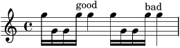
If different stem lengths for the same note bothers
you, realize that the complexities of typesetting
beams demand that stem lengths vary, often greatly.
See the attached png for an example.
What is bad about the Mozart, Debussy and Bizet
examples? They look okay to me.
One more thing:
> I don't feel that it is important to consider
> the plate printing dilemmas in computer output.
We do.
Read the (partly outdated but still relevant) essay:
http://lilypond.org/web/about/automated-engraving/
- Mark
__________________________________________________
\version "2.13.0"
\relative {
g''16 g, g g'^good g4
g16 g, g g'^bad
\override Stem #'length = #13.5
g4
}
 stem-lengths2.png
Description: PNG image
- Re: Stem lenghts, (continued)
- Re: Stem lenghts, Pekka Siponen, 2009/05/11
- Re: Stem lenghts, Werner LEMBERG, 2009/05/11
- Re: Stem lenghts, Mark Polesky, 2009/05/11
- Re: Stem lenghts, Han-Wen Nienhuys, 2009/05/11
- Re: Stem lenghts, Pekka Siponen, 2009/05/11
- Re: Stem lenghts, Werner LEMBERG, 2009/05/11
- Re: Stem lenghts, Pekka Siponen, 2009/05/11
- Re: Stem lenghts,
Mark Polesky <=
- Re: Stem lenghts, Pekka Siponen, 2009/05/11