[Top][All Lists]
[Date Prev][Date Next][Thread Prev][Thread Next][Date Index][Thread Index]
Re: Ultra-thick barlines in PDF output (PNG OK)
|
From: |
Sandy Nicholson |
|
Subject: |
Re: Ultra-thick barlines in PDF output (PNG OK) |
|
Date: |
Wed, 23 Dec 2009 19:24:46 +0000 |
Thanks to all those who have followed up on my original bug report. Sorry
for my own tardiness in getting back to you all.

First of all, Carl Sorensen wrote (concerning Graham Percival's two
examples):

> For me, on OSX 10.5, barline-test1 has ultra-thick barlines, but
> barline-test2 has good barlines.

I can confirm that Preview 5.0.1 in 10.6.2 behaves the same way. The first
example (which, according to Neil Puttock, uses default LilyPond settings)
shows thicker barlines at small viewing scales, and the two barlines in that
example vary in their relative thicknesses at intermediate scales; the
barlines also protrude noticeably above and below the staff lines. The
second example looks reasonably good in Preview at all scales.

Adobe Reader 9.2.0 does a far worse job than Preview at maintaining even
line thicknesses except at the largest viewing scales. Not only are barlines
affected, but also note stems. Reader also shows the same protrusion in the
first example as seen in Preview.

For a third `opinion', I tried TeXworks 0.2.3. It's not something I'd
normally use as a PDF viewer, but as it uses Poppler as its rendering
library, I thought that it might be worth trying. Like Preview, TeXworks
rendered most of the elements well at various scales, except that barlines
in both examples were poorly rendered at small scales. Even at larger scales
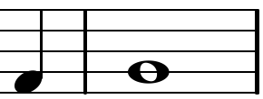
(see test1-poppler.png and test2-poppler.png, attached), the barline
thicknesses are uneven for both examples, and both exhibit barline
protrusion (although only below the stave for the second example). The first
example shows a particularly thick first barline.

I did also try printing some PDF and PNG examples, but wasn't able to
reproduce the differences that I'd seen a year or so ago - so it looks as
though something has changed for the better, either in LilyPond or in my own
system configuration. There is now also remarkably little difference between
the PDF and PNG renditions. Apologies for having jumped to the conclusion
that nothing had changed, just on the strength of what I saw on-screen.

It does seem to me, though, that there is still a bug (or two) here that
might be fixable by the LilyPond team - even if it's really a question of
working around the vagaries of viewers (although I'm prepared to be
corrected!).

For online viewing (which should surely be taken into account if LilyPond is
to be taken seriously, even if most of us are unlikely to play or conduct
from an electronic music stand yet), barlines ought to be rendered just as
well as stems, beams and similar elements. But they render poorly in all the
PDF viewers that I've tried, particularly at small scales. With a 1200 DPI
PNG, Preview struggles on my machine, but when it eventually displays a
page, it is perfectly clear, so this isn't just down to a fundamental
problem with displaying lines on a low-resolution display.

At moderate viewing sizes (larger than 100% anyway), Preview doesn't do too
bad a job of rendering barlines - they just appear somewhat heavier than I'd
like and give a cluttered, unprofessional look to the displayed page. (At
sufficiently large viewing scales, I agree with Trevor Daniels that normal
barlines are about 50% wider than stems.)

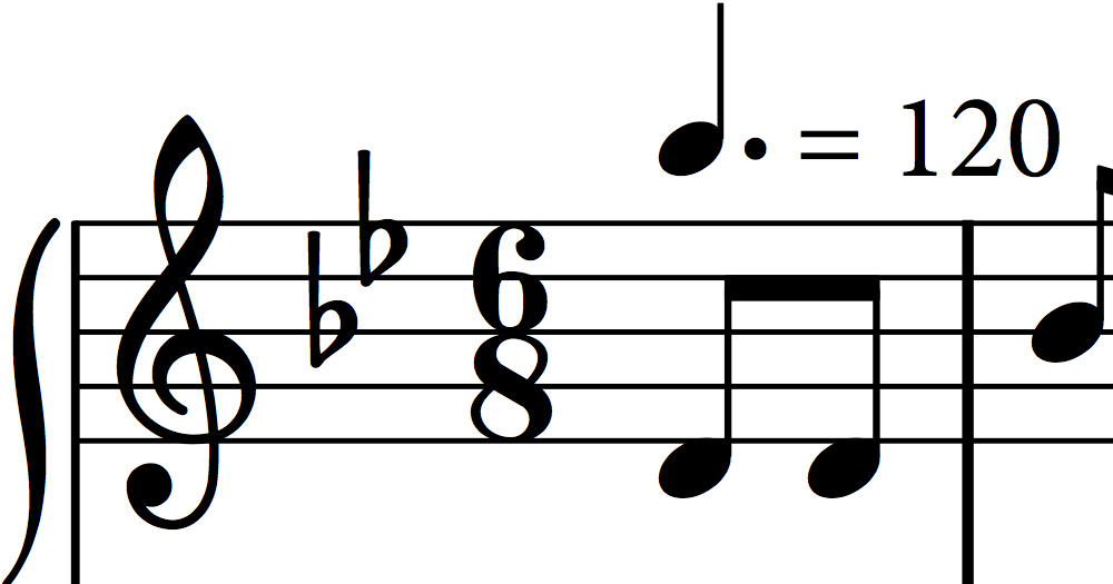
Is the barline that appears at the beginning of a multi-stave system (e.g.
in the piano example shown in piano-stave.png, attached) meant to be just
marginally thicker than a stem and therefore distinctly thinner than normal
barlines? (I do actually prefer the width of this initial barline, which
seems, on the printed page, to be less obtrusive than the ordinary
barlines.) Printed piano music editions that I have to hand (from a variety
of publishers of various vintages) all seem to favour uniform - and
comparatively light - barlines.

Thanks for everyone's input. I hope I haven't muddied the waters by
inadvertently overstating the problem initially.

Best wishes
Sandy Nicholson


