[Date Prev][Date Next][Thread Prev][Thread Next][Date Index][Thread Index]
Ratio black and whole noteheads
|
From: |
Urs Liska |
|
Subject: |
Ratio black and whole noteheads |
|
Date: |
Mon, 25 Jul 2016 12:24:22 +0200 |
|
User-agent: |
Mozilla/5.0 (X11; Linux x86_64; rv:45.0) Gecko/20100101 Thunderbird/45.1.1 |
Hi all,
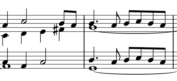
addressing a question I received about the attached score where the
dotted crotchet in r.h. (middle of the excerpt) was considered to be
placed too far to the left I investigated why this looks weird.
Gould doesn't give a proper example of a whole note in parallel with a
black note (at least I didn't find one) but some older editions seem to
indicate that the left-alignment is considered standard.
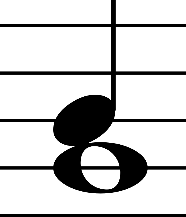
But Gould states that the semibreve note head should be wider than the
black notehead by the proportion of 2 1/2 to 3. And as you can see from
the attached excerpt LilyPond has a ratio of ca. 2 to 3, meaning that
the semibreve is considerably wider than Gould's suggestion.
I'm not sure what to do about this, but I have to agree that in the
given example score this ratio looks bad. So I'd like to have a
discussion about it here. Maybe it's a quite massive modification but
should be consider making the whole note notehead smaller/narrower?
Urs
 whole-size.png
Description: PNG image
notehead-ratio.png
Description: PNG image
- Ratio black and whole noteheads,
Urs Liska <=