Description: JPEG image
|
| From: | edes |
| Subject: | Re: modern-straight and flat- flags too thick and too spaced apart |
| Date: | Sun, 17 Feb 2019 23:52:10 -0300 |
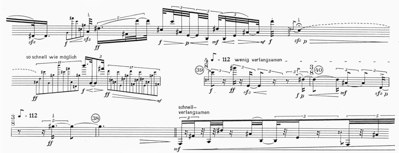
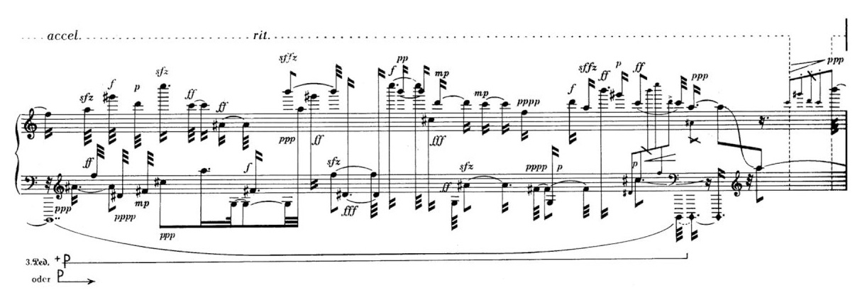
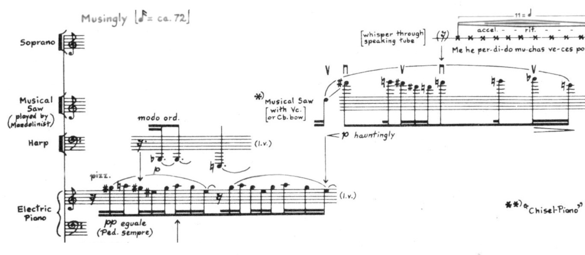
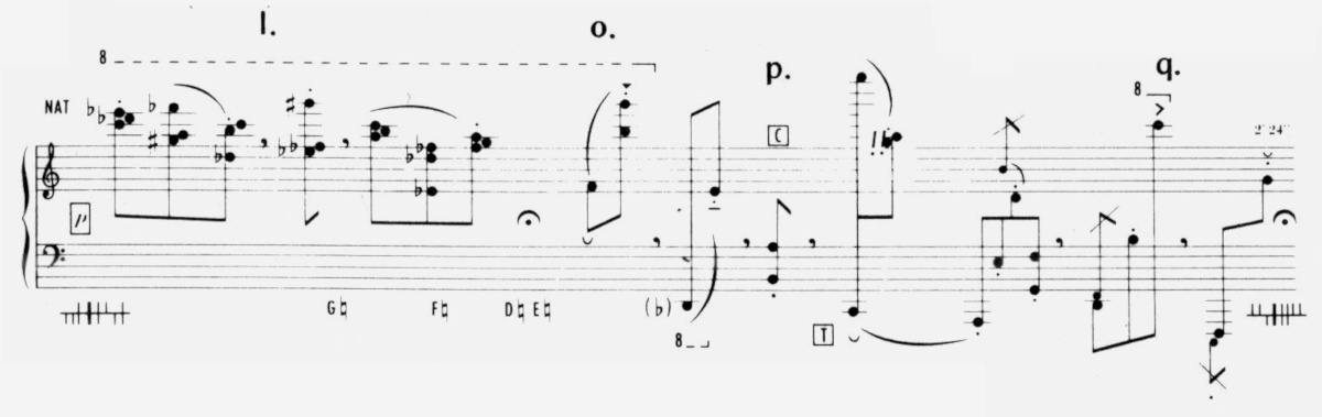
el 2019-02-17 a las 21:41 Thomas Morley escribió:

> I'm currently working on it.

Thank you!


> Though, there is a design-decision we need to do.

Indeed...

In general terms, I stand by my original opinion that both flat *and*
modern-straight flags should behave like beams (but I might be missing
something, of course...).

I attach two examples by Stockhausen (Zeitmaße and Klavierstück V, both
Universal Edition). In my opinion, these could very well be taken as a
model. Please see also the short excerpts from two different numbers of
Boulez' Le Marteau sans maître (also UE).

In the example by Crumb (Ancient Voices of Children), there's no
difference between horizontal (flat) flags and beams.

Finally, I attach an example by Kagel. Among many other problems that make
this score ugly, beams and stems are too thin to my taste. But in any
case, they are consistent.

> Disadvantage would be that a stem with default flag would often have a
> different visible length compared to a stem with straight flags.

That is normally a global setting, isn't it? I can't remember right now
any important piece of the repertoire that mixes old and modern flags. But
my knowledge of the repertoire is by no means encyclopaedic.

BTW, in all the examples, stems are noticeably longer than the default in
lilypond, that follows older practices.

I hope these examples will help you find a good general criterion.

Best,

ee


--
![]() stockhausen_zm.jpeg
stockhausen_zm.jpeg
Description: JPEG image
![]() stockhausen_ks.jpeg
stockhausen_ks.jpeg
Description: JPEG image
![]() crumb.jpeg
crumb.jpeg
Description: JPEG image
![]() kagel.jpeg
kagel.jpeg
Description: JPEG image
| [Prev in Thread] | Current Thread | [Next in Thread] |