[Date Prev][Date Next][Thread Prev][Thread Next][Date Index][Thread Index]
Re: [Worg] Proposing a few CSS changes
|
From: |
Adam Porter |
|
Subject: |
Re: [Worg] Proposing a few CSS changes |
|
Date: |
Sat, 02 Oct 2021 07:07:41 -0500 |
|
User-agent: |
Gnus/5.13 (Gnus v5.13) Emacs/26.3 (gnu/linux) |
Hi Timothy,
Timothy <tecosaur@gmail.com> writes:
> Great! I’ve just taken a peek and it’s a clear improvement in my eyes
> 🙂.
:)
>> Note that, after I made the other changes, the links scattered around
>> the page clashed very badly with the nice “Org green” and black theme,
>> so I adjusted them as well (as detailed in the commit message). I tried
>> using “Org green” for the link text, but it seemed too low-contrast, as
>> well as a bit distracting while reading, so I opted to use colorize just
>> the underlines, and to make the link text green when hovering.
>
> I just had a look at this, and I tried a darkened green (#08402e). I think
> this
> may be the best option.
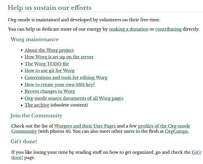
That may be a good choice, yes. But I almost feel like, with the
headers also being a very similar green, it's a bit of "green overload"
in some areas. For example, this screenshot:
 links.png
Description: PNG image
But in other places it does look nice, so I won't protest if you want to
make that change.  :)

>> Note as well that I ended up using 48em for the content width due to the
>> unicorn logo in the corner being covered up by wider content than that
>> (in a half-1080p-width browser window, which seems like an important use
>> case to consider).
>
> We should probably update the “angry unicorn” to the logo on the homepage,
> perhaps <https://orgmode.org/resources/img/org-mode-unicorn.svg> or a
> simplified
> version.

Well, personally, I don't mind having "the original" there.  :)  But I'll
leave that decision to you and others.

Thanks.