Description: Text document
|
| From: | Stefan Kangas |
| Subject: | Re: Tick Reduction |
| Date: | Fri, 19 Nov 2021 11:28:34 +0100 |
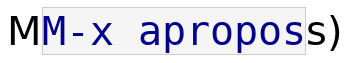
Lars Ingebrigtsen <larsi@gnus.org> writes:

> Looks good to me too, but this reminded me of one thing: Emacs (by
> default) chooses a variable-pitch font that is markedly smaller than the
> monospaced font, in my experience, and you can see the same in your
> screenshot.  So I have this in my .emacs:
>
> (set-face-attribute 'variable-pitch nil :height 130)
>
> I think we should look into that, because the height discrepancy between
> those two fonts is disturbing -- see the "(see also M-x apropos)" line
> in your screenshot.

Here is my analysis.

First, take a look at the below screenshot.  The monospace text uses
Bitstream Vera Sans Mono, and the variable width "M" and "s" on the
sides use Bitstream Vera Sans.  Both are the same size as reported by
`C-u C-x ='.
![]() txtghxrPitL98.txt
txtghxrPitL98.txt
Description: Text document
![]() mono-vs-prop.png
mono-vs-prop.png
Description: PNG image
![]() first-line.png
first-line.png
Description: PNG image
![]() first-line-red.png
first-line-red.png
Description: PNG image
![]() txtE7qGCQJl0e.txt
txtE7qGCQJl0e.txt
Description: Text document
| [Prev in Thread] | Current Thread | [Next in Thread] |