Description: PNG image
|
| From: | Janek Warchoł |
| Subject: | Re: do we want special versions of the accidentals for use with text? |
| Date: | Tue, 27 Sep 2011 10:02:12 +0200 |
2011/9/27 Bertrand Bordage <address@hidden>:
> This looks great!
Thanks!
> What still needs to be changed in my opinion:
> * lower the sharp and the natural so that it fits in the text.
> * decrease the size of all accidentals in markups.
I also think they are too big. The question is, how should we achieve
that? Is there something like
"musical-glyphs-font-size-when-used-in-markups"? Or should we simply
make new glyphs smaller (i somehow don't like this)?
> In fact, the accidentals shouldn't overshoot the height of a normal text:
> not higher than 'f' and not lower than 'g'.
Yes, approximately.
2011/9/27 Werner LEMBERG <address@hidden>:
> I can imagine that the bulb of the flat sign is a bit larger
> horizontally to get a similar optical weight as the letter before.
I can try this.
The attachments i'm sending currently are results of playing with
image editor, actually. I will make new glyphs when the code that
uses them will be ready.
> It would be interesting to see trailing accidentals if combined with
> digits from a figured bass. Maybe we should have a third, different
> looking set of accidentals?
Maybe, but i'd prefer to avoid this if possible for the sake of simplicity.
> I suggest to move down both the sharp and
> natural sign a bit so that its horizontally oriented elements are
> nearer to the baseline.
2011/9/27 Bertrand Bordage <address@hidden>:
> Maybe lower a little the sharp and the natural would be perfect.
I think we have to answer a general question: how (technically)
aligning accidentals should work. Currently it seems a royal mess - i
haven't investigated source yet, but look at this snippet
\markup { \flat \sharp \natural \large "blah" }
\figures { <6>16 <_-> <_!> <_+> <4> }
\figures { <6-> <6!> <5+> }
\chords { fis es }
\new ChordNames { \germanChords \chordmode { fis es } }
in each line accidentals are aligned in a different way. This sucks.
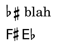
There are two different ways we would like to align accidentals (see
attachment 1; notice that relative aligning of flat and sharp is
different). I think these two ways would be enough for all uses. How
do we want to implement them? The first method (for use with text)
should be implemented by moving the baseline of the glyphs, i think.
For the second method, i see two possibilities:
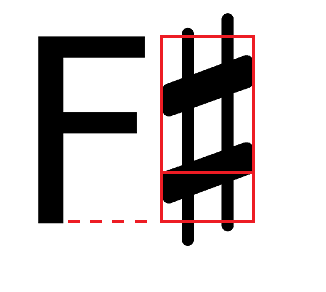
- use bounding box (adjusted a bit), i.e. the bottom of bounding box
becomes baseline (i hope its possible?); see attachment 2,
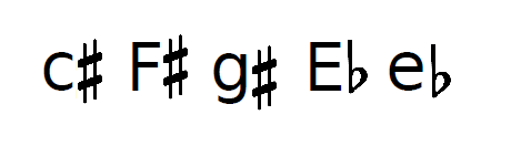
- vertically center the accidental on parent grob. This will give
different results in case of differently sized grobs (see attachment
3). There can also be a problem when there is no parent grob, for
example in figured bass.
What do you think?
cheers,
Janek
![]() attachment 2.png
attachment 2.png
Description: PNG image
![]() attachment 3.png
attachment 3.png
Description: PNG image
![]() attachment 1, two ways.png
attachment 1, two ways.png
Description: PNG image
| [Prev in Thread] | Current Thread | [Next in Thread] |