lilypond-user
[Top][All Lists]
Advanced

[Date Prev][Date Next][Thread Prev][Thread Next][Date Index][Thread Index]

Re: Unicode accidentals vs. Markup accidentals


From: Saul Tobin
Subject: Re: Unicode accidentals vs. Markup accidentals
Date: Sun, 15 Jan 2023 22:52:50 -0800

Lilypond ships with a text font as well as a music font. I agree that I suspect that currently Lilypond's text font does not actually define these Unicode music characters, so it falls back on the OS to find them. Why not just add copies of Emmentaler glyphs to the Lilypond text fonts for characters within the Unicode spec? That seems like a pretty reasonable suggestion to me...

I also don't think it's unreasonable to suggest that the default typography should look good. I hope we can agree that the output on staves 1 & 2 is significantly worse than the output on staff 3 (attached picture if it doesn't display inline for you).
image.png
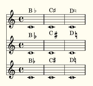
Staves 1&2 are Unicode and default markup glyphs as in my original post (compiled on Windows). To get staff 3 the following is required:

\new Staff {
    c'1^\markup\concat\vcenter { B \hspace #0.2 \fontsize #-1.5 \flat }
    c'1^\markup\concat\vcenter { C \hspace #0.1 \fontsize #-2 \sharp }
    c'1^\markup\concat\vcenter { D \hspace #0.2 \fontsize #-1.5 \natural }
  }

IMO Staff 3 should be the default output, not something that requires so much tweaking.

On Sun, Jan 15, 2023 at 9:56 PM Werner LEMBERG <wl@gnu.org> wrote:

> IMO Lilypond should render musical Unicode characters using the same
> font as the music itself,

No, it should not.  If you select font 'foo' for text rendering,
everything should come from that font.  If a certain character is not
in 'foo', it is the FontConfig library rather than LilyPond that
selects a fallback font – and it is more or less unpredictable which
fallback is actually used due to the way how FontConfig works.  If you
want LilyPond glyphs you have to explicitly select them.

In general, I strongly suggest that you *always* select the correct
font for text rendering to assure that your document stays portable
and can be reliably compiled on other systems.

> and the default size/alignment of the glyphs within text markup
> should not require adjustment to look correct.

How do you want to adjust the size in an automated way?  Just think of
using Times New Roman together with Courier, as shown in the image –
what size should the LilyPond glyphs have?  And the default
positioning is not too bad, as demonstrated in the other image.

```
\markup { "foo" \number "♭♯♮" "bar" }
```


    Werner

reply via email to

[Prev in Thread] Current Thread [Next in Thread]