[Top][All Lists]
[Date Prev][Date Next][Thread Prev][Thread Next][Date Index][Thread Index]
Re: fine-tuning new flags - feedback needed
|
From: |
Janek Warchoł |
|
Subject: |
Re: fine-tuning new flags - feedback needed |
|
Date: |
Fri, 11 Feb 2011 22:37:10 +0100 |
2011/2/11 Han-Wen Nienhuys <address@hidden>:
> 2011/2/5 Janek Warchoł <address@hidden>:
>>> * It seems to shorten the flags at the tip end too. I'm not sure if
>>> that is desired.
>>
>> Do you mean the difference marked in attachment ("tip difference.png")?
>
> Yes.
>
>> If so, its desired. Reasons for the change were:
>> - old stem length was so big that the unbeamed 32nd note was reaching
>> a lot higher (half staffspace) than beamed 32nds lying higher on the
>> staff (see "lower note higher stem.png")
>
> Don't take 32nds as a standard for comparing beams and stems. Due to
> its configuration, the 32nd beam has very little room to move
> vertically. See for example
>
> \relative {
> g32 g[g] a32 a[ a] b32 b32[ b] c32 c32[ c] d32 d[ d] e e[ e] f f[ f]
> }
>
> as you can see, there is a discrepancy that goes the other way too.
No, that's a bad example! I mean, to me there's a whole another
problem in what you posted above. The problem is that the stem of
unbeamed notes is lenghtened differently than in case of beamed notes.
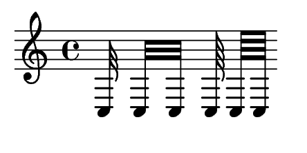
Look at this, it's a more pronounced example: { c32 c[ c] c64 c[ c] }
- the unbeamed stems are lenghtened to middle staff line, while beamed
stems are lenghtened more than that. That's not the case with 8ths and
16ths: { c8 c[ c] c16 c[ c] } looks fine.
In fact, i wondered if this behaviour is correct. My personal opinion
is that it isn't correct, but i have no idea what engraving books say.
In my opinion it should look like attached unbeamedVsBeamed.png .
Can you (or someone else) check this in music engraving books?
>> - the stem length and flag characteristic points didn't correspond
>> nicely to 16th and 64th flags (see red lines in "upstem flags
>> old.png")
>
> Right. While you are talking about the 32nd flag only, my impression
> is that after your change, the flags overall are at smaller or at
> equal height relative to the corresponding beam.
They are at equal height or taller relative to the corresponding beam.
However, there might be an optical illusion going on here and that's
why some unbeamed stems appear shorter than they really are.
It may be necessary to adjust for that.
> I would like them to
> pop out a bit to give a visual balance against the (much heavier)
> beam.
This might be the right thing to do.
>>> In normal non-forced positions, the flags are a little bit taller than
>>> the beamed notes from the same position, and the old version maintains
>>> that for the forced positions too (of course, the beaming quants
>>> sometimes make it less obvious). This effect is gone in your verison
>>> example, it seems all forced stems are getting shorter than the beams.
>>
>> I cannot say what will happen in "real-life situations", but in my
>> example ("flag testing.ly") it's not quite as you say. 2.13.47 output
>> was like that:
>> - stems of shortened 8ths, 32nds and 128th with flags were longer than
>> beamed ones,
>> - stems of shortened 16ths and 64ths with flags were equal or
>> *shorter* than beamed ones.
>
>> In my suggested output shortened 32nd notes with flags are a bit
>> longer than beamed ones, 8ths are a bit longer or equal, and all other
>> are equal. No flagged note is shorter than corresponding beamed one.
>> Are you sure that you haven't switched the files when comparing?
>
> I am sure; the version number is on the bottom. I am looking at the
> flag test proofsheet. Compare for example, a'' 8th upstem (3rd line).
> The old version pops out, the new version is as long as the beam.
That's true, however compare my proposed output with old output in
case of the notes marked in red here:
http://imagehosting.nu/images/flagtestin.png
What's most interesting is that it's the beamed stems length that
changed (which i didn't touch at all).
> It's best to look at the beams outside the staff, as the ones inside the
> staff are more restricted in allowed positions due to interference
> from the stafflines
>
> Of course, it may be that the beaming is not perfect, and should be
> adjusted in some situations, but maybe we could solve one problem at a
> time? Ie. fix the discrepancy of the 32nd, and improve the shape for
> the shortened flags at the note head end? We could try to treat the
> tip lengths in a separate patch; possibly beam scoring should be tuned
> too.
Yes, i agree. We should do one thing at a time. I even see another
issue that can be separated here - the transition in length of
unbeamed notes (the thing illustrated by the second part of the first
system in "flag testing").
I'll divide my patch as soon as i resolve some problems that i have
with my git repository (hopefully this will happen tomorrow), and i
think we shall discuss these issues in separate threads.
>>> Is there a way to main
>>
>> ..?
>
> sorry - brainfart. I was going to write "maintain the lengths of the old
> flags"
Ah, ok.
>>> * For the longer (8th, 16th), it trades some voloptuousness for
>>> practicality. I think the overall feel of feta is more on the
>>> exuberant side, so I think we could lessen the effect there, and
>>> lengthen the hooks a bit more.
>>
>> I'm not sure if i understand what effect you want to achieve. From my
>> experiments it looks like it won't work well, though. I'll post some
>> examples tomorrow.
>
> Especially the 8th up flag in shortened position (f'' and higher)
> looks stocky rather than elegant and slender. If you let the flag
> length overall be longer, it will be easier to maintain the slender
> look.
Ah, you mean upstem 8th flag. I thought you were referring to the
downstem 8th flag.
Yes, i agree that upstem 8th flag is shortened quite aggresively.
On one hand, this makes it look more similar to all other shortened
upstem flags. Also, it was easy to code it this way.
On the other hand, it's very different from the old look, and, as you
say, quite stocky.
I don't insist on keeping it this short.
> The 16th has the same problem, but much less space to make it still
> look slender, so I understand it may not be possible.
>
>>> * I'm not sure, but it looks like the outer flag of the 64th and 128th
>>> upstem flag seems to pop out a bit. There is a correction for this,
>>> perhaps you uptune that correction for the shorter up flags.
>>
>> I don't see what you mean.
>> And by 'outer' do you mean topmost or bottommost?
>
> I mean that the hip_wid_multiplier for the last hook of the flag is
> smaller (0.95 vs. 1.0)
I see. Yes, perhaps it should get a bit smaller in shortened flags.
Maybe even penultimate hook in shortened flags should have
hip_wid_multiplier less than 1.
cheers,
Janek
 unbeamedVsBeamed.png
Description: PNG image
- Re: fine-tuning new flags - feedback needed, (continued)
- Re: fine-tuning new flags - feedback needed, Carl Sorensen, 2011/02/07
- Re: fine-tuning new flags - feedback needed, Janek Warchoł, 2011/02/07
- Re: fine-tuning new flags - feedback needed, David Kastrup, 2011/02/07
- Re: fine-tuning new flags - feedback needed, Reinhold Kainhofer, 2011/02/07
- Re: fine-tuning new flags - feedback needed, Graham Percival, 2011/02/08
- Re: fine-tuning new flags - feedback needed, Carl Sorensen, 2011/02/07
- Re: fine-tuning new flags - feedback needed, Graham Percival, 2011/02/08
- Re: fine-tuning new flags - feedback needed, Carl Sorensen, 2011/02/08
- Re: fine-tuning new flags - feedback needed, Graham Percival, 2011/02/08
- Re: fine-tuning new flags - feedback needed, Han-Wen Nienhuys, 2011/02/11
- Re: fine-tuning new flags - feedback needed,
Janek Warchoł <=
- Re: fine-tuning new flags - feedback needed, Han-Wen Nienhuys, 2011/02/11
- Re: fine-tuning new flags - feedback needed, Janek Warchoł, 2011/02/12
- Re: fine-tuning new flags - feedback needed, Marek Klein, 2011/02/24
- Re: fine-tuning new flags - feedback needed, Jan Warchoł, 2011/02/24
Re: fine-tuning new flags - feedback needed, Keith OHara, 2011/02/04
Re: fine-tuning new flags - feedback needed, Werner LEMBERG, 2011/02/05
Re: fine-tuning new flags - feedback needed, Han-Wen Nienhuys, 2011/02/05