Description: PNG image
|
| From: | Janek Warchoł |
| Subject: | Re: fine-tuning new flags - feedback needed |
| Date: | Sun, 6 Feb 2011 00:13:15 +0100 |
2011/2/5 Carl Sorensen <address@hidden>:
>
> On 2/4/11 3:59 PM, "Janek Warchoł" <address@hidden> wrote:
>
>> W dniu 4 lutego 2011 20:13 użytkownik Carl Sorensen <address@hidden>
>> wrote:
>>> Read shows a larger gap on 64th and 128th flags than on the longer note
>>> duration flags.
>>>
>>> The downstem flags shown by Read have no gap between the flag and the head
>>> for eighth, sixteenth, and 32nd notes. I have not looked into
>>> beautifully-engraved music to see what the publishers' practice is.
>>
>> Isn't all this a matter of the font design exclusively? We have our
>> own font and we design it the way we like it.
>
> Absolutely. But the way we like it should be informed by the best engraving
> practice.
Point for you.
So, examples or rationales are welcome.
>> As for the downstem 8th flag, it's current look is simply inconsistent
>> with other flags (and with itself - it looks different when notehead
>> lies on the staff line insted of between the lines). Look at the
>> attachment.
>
> Read's downstem flag is actually inconsistent in different locations, which
> is probably consistent with a hand-engraved look.
Maybe...
All i can say is that i find the lack of gap between downstem 8th flag
and it's notehead visually disturbing. It doesn't look like a standard
note to my eyes when the flag and the notehead are not discernible.
>>>> - the shortened upstem 8th flags are shorter (now the dots don't
>>>> collide with them!).
>
> Great! That's one of the items Read mentions that should happen -- avoiding
> the dots (although he says he does it by having different flags when the dot
> is present).
I'm interested in adding this (and other improvements) to the dot code
after this flags issue is finished.
>>> Is there a reason you haven't uploaded the patch to Rietveld for review?
>> (...)
>> I tried doing things described in CG 3.3.4 "Uploading a patch for
>> review" now, but i'm stuck after calling
>> git cl upload origin/master
>> below is what the terminal showed me (i entered that description
>> earlier, when i was using lily-git):
>> (...)
>>
>> I cannot do anything with this, only move cursor. pressing Return does
>> nothing and i cannot scroll this too. Spooky...
>
> Once you get to that point, just hit the escape key, then type :wq.
> You are in vim, or some equivalent editor.
I heard about vim...
Yeah, so now i've experienced the Vim Joke and i have to admit that i
fulfill the Vim hypothesis: i've generated random string trying to
exit the program. :P
Frankly, i'd prefer some sort of warning there... "Beware! For thou
hath stepped on the quicksands of Vim" or something like that :)
> You're most of the way there, and you're a strong contributor. But if you'd
> prefer, I'll be happy to post the patch for you.
I've succeded thanks to your help :)
Here is the link: http://codereview.appspot.com/4134041
Thank you very much for help and for such kind words! I'm really
nicely surprised :)
2011/2/5 Keith OHara <address@hidden>:
>
> Janek,
> I am not going to have an aesthetic opinion. I read and write mostly piano
> music, which is crowded enough that I don't notice changes on the scale you
> are proposing.
Some of them are indeed hard to spot, especially on computer screen
(unless you zoom).
However, the differrencies in length of unflagged stems should be
discernible, especially in case of notes lying on middle, 2nd and 4th
staff line, and they will be affecting much scores (for example Bach
chorales posted recently are full of these).
> You should use the properties defined in scm/define-grobs.scm under Stem,
> 'lengths' and 'stem-shorten', to hold your adjusted values.
> Other parts of the code might need to access these values, in order to know
> how much to lengthen a stem to avoid other note-heads, for example.
Ah, i see. I hope to be able to change these two tomorrow morning.
2011/2/5 Werner LEMBERG <address@hidden>:
>> this is (hopefully) the final version of the new flags; it's a mix of
>> previous two propositions and some new modifications. I must admit
>> that i'm proud of it :)
>
> I like the new shapes.
Great to hear this!
> However, only tests and comparisons with
> various documents will show where and when the new flags can be used.
I'll gladly compile any example you provide.
2011/2/5 Han-Wen Nienhuys <address@hidden>:
> Hey Janek,
>
> thanks for looking into this, and welcome to the world of font-design
> aka. endless fiddling :)
exactly :)
> Overall comments:
>
> * There is no question that this is better for the 32nd and shorter in
> forced directions, especially for the head-facing part of the flag.
>
> * It seems to shorten the flags at the tip end too. I'm not sure if
> that is desired.
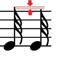
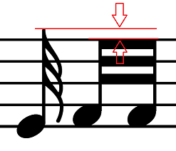
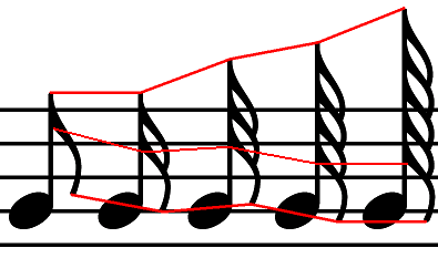
Do you mean the difference marked in attachment ("tip difference.png")?
If so, its desired. Reasons for the change were:
- old stem length was so big that the unbeamed 32nd note was reaching
a lot higher (half staffspace) than beamed 32nds lying higher on the
staff (see "lower note higher stem.png")
- the stem length and flag characteristic points didn't correspond
nicely to 16th and 64th flags (see red lines in "upstem flags
old.png")
> In normal non-forced positions, the flags are a little bit taller than
> the beamed notes from the same position, and the old version maintains
> that for the forced positions too (of course, the beaming quants
> sometimes make it less obvious). This effect is gone in your verison
> example, it seems all forced stems are getting shorter than the beams.
I cannot say what will happen in "real-life situations", but in my
example ("flag testing.ly") it's not quite as you say. 2.13.47 output
was like that:
- stems of shortened 8ths, 32nds and 128th with flags were longer than
beamed ones,
- stems of shortened 16ths and 64ths with flags were equal or
*shorter* than beamed ones.
In my suggested output shortened 32nd notes with flags are a bit
longer than beamed ones, 8ths are a bit longer or equal, and all other
are equal. No flagged note is shorter than corresponding beamed one.
Are you sure that you haven't switched the files when comparing?
> Is there a way to main
..?
> * For the longer (8th, 16th), it trades some voloptuousness for
> practicality. I think the overall feel of feta is more on the
> exuberant side, so I think we could lessen the effect there, and
> lengthen the hooks a bit more.
I'm not sure if i understand what effect you want to achieve. From my
experiments it looks like it won't work well, though. I'll post some
examples tomorrow.
> * I'm not sure, but it looks like the outer flag of the 64th and 128th
> upstem flag seems to pop out a bit. There is a correction for this,
> perhaps you uptune that correction for the shorter up flags.
I don't see what you mean.
And by 'outer' do you mean topmost or bottommost?
>> (as for the c++ code - i'm totally aware that it needs improvement.
>
> Can you look in define-grobs.scm ? I didn't look closely, but I
> suspect a lot of the things you are hard-coding in C++ are actually
> soft-coded in the details property; if not, we should work to softcode
> them; it will make your experiments easier as well.
Yes, i'll fix that.
thanks for comments!
Janek
![]() tip difference.png
tip difference.png
Description: PNG image
![]() lower note higher stem.png
lower note higher stem.png
Description: PNG image
![]() upstem flags old.PNG
upstem flags old.PNG
Description: PNG image
| [Prev in Thread] | Current Thread | [Next in Thread] |